Oakland Public Library Card Design
Recently the Oakland Public Library decided to renew their card designs.
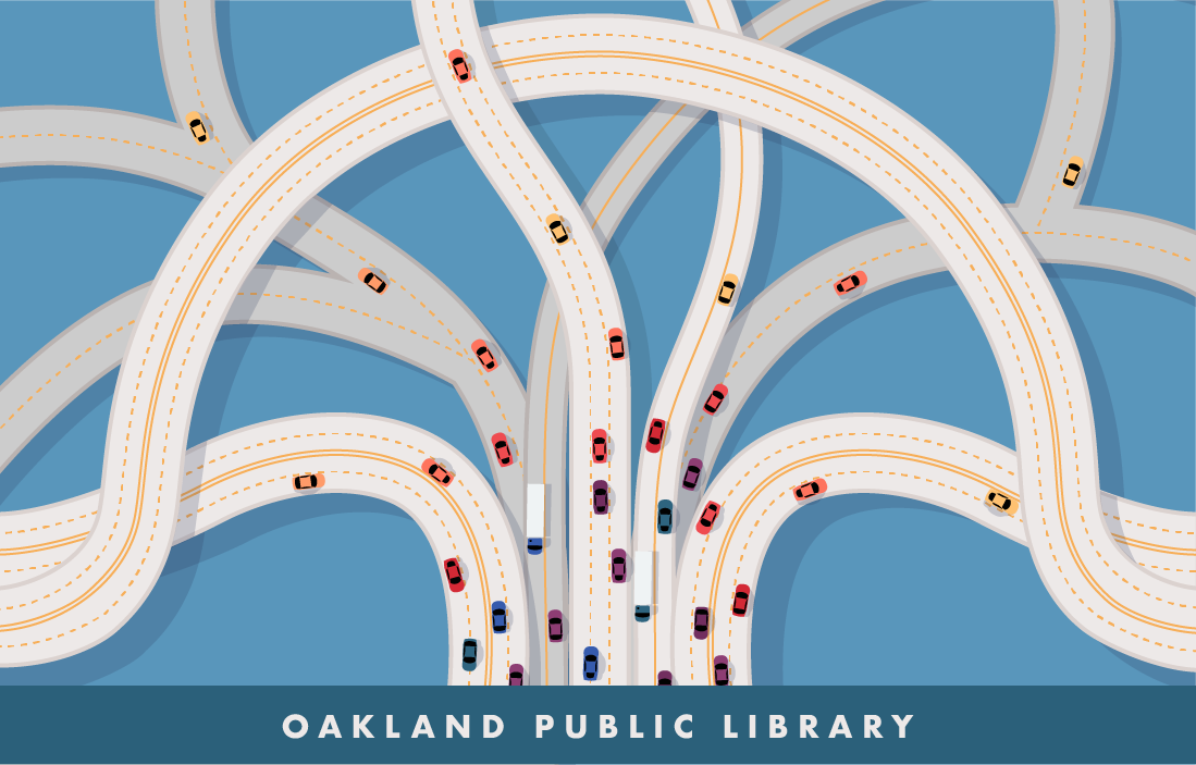
For my design I decided to move away from typical "adventures of reading" type illustrations, and do something more interesting and abstract. As I sketched I was struck by how the City of Oakland logo reminded me of the MacArthur Maze - a large, tangled highway interchange just east of the Bay Bridge. So, my design is a fusion of the Oakland tree and the MacArthur Maze.
To me this design represents the way that Oakland is the intersection of many different cultures and ideas.
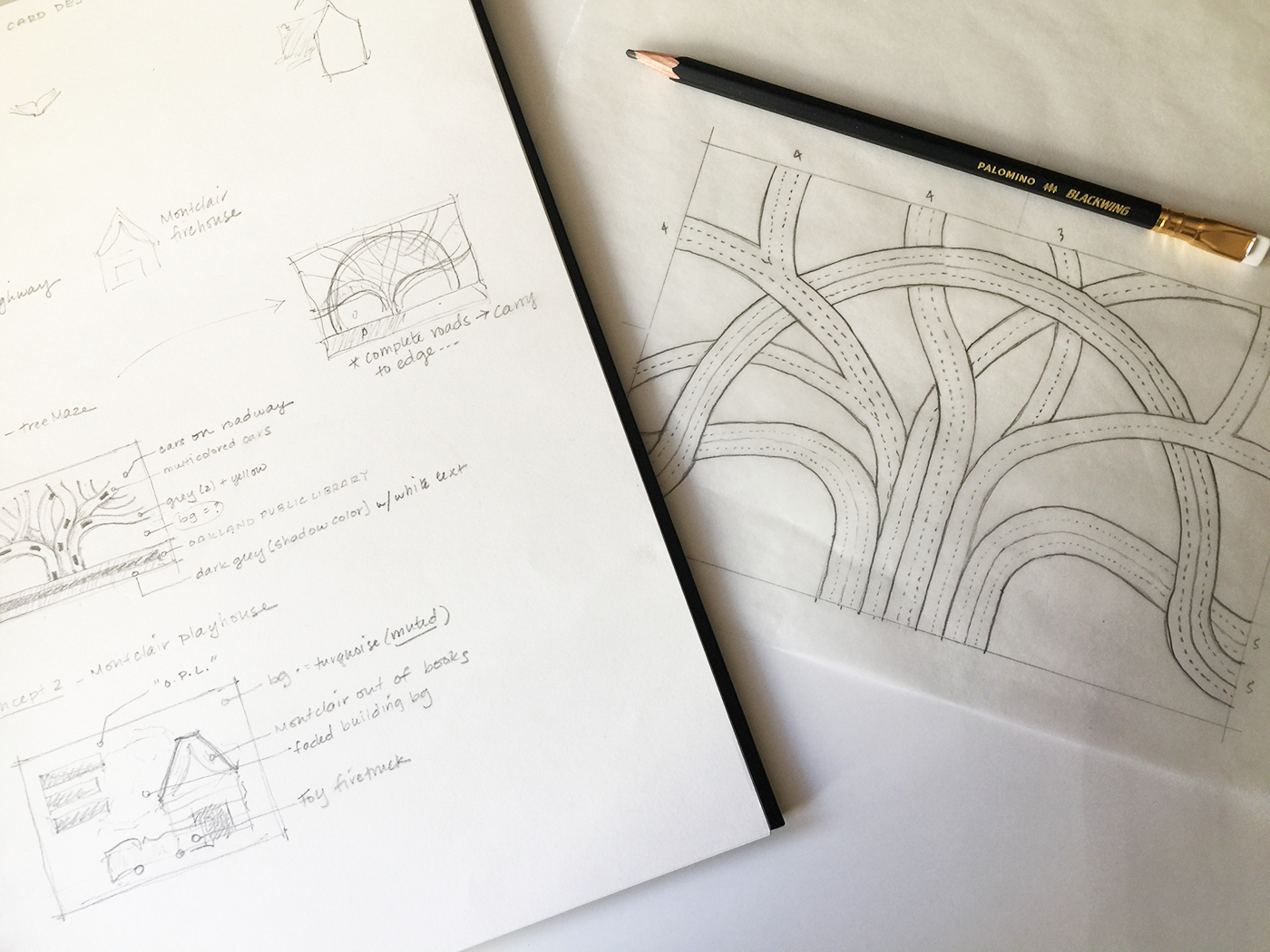
I started with pencil and paper (as always) to develop an underlay for my vector illustration. Then I created the final artwork in Adobe Illustrator.
"Crossroads"